Data Visualisation
Presenting your data in a visual context is a way of helping people to understand the significance of the data; below describes how international data available via UK Data Service .Stat could be visualised.
Creating a static data visualisation within UK Data Service .Stat
UK Data Service .Stat itself includes a dynamic charting and mapping tool allowing you to create line charts, bar charts, choropleth maps and scatter plots using the current data selection. The charting engine is limited to work with 25,000 data points - data selection can be carried out in your table before creating a chartmap. The table dimension and variable selections are reflected in the chart/map you create. The UK Data Service .Stat User guide provides further information on using the visualisation features within UK Data Service .Stat – and remember, cite the data!
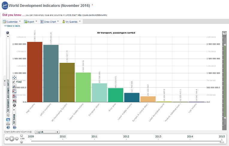
- Citation: World Bank (2016): World Development Indicators (Data downloaded: 7 December 2016). UK Data Service.
Generating data visualisations from API queries
In addition to the visualisation facilities within UK Data Service .Stat, data can also be extracted via API using our SDMX-JSON web service and fed into an appropriate visualisation tool.
The following is an example of a line chart created with the JavaScript chart.js library from the results of an API query on the OECD Regional Demography dataset on UK Data Service .Stat.
- See the code for this and more visualisations of UK Data Service .Stat data created with chart.js
- View our guide to learn how to create the API query
- Chart.js documentation
Creating visualisations from CSV formatted data
Data from UK Data Service .Stat can also be downloaded into a CSV format file from where it can be visualised using a tool like Dimple.JS.
The following is an image of an example step chart created with Dimple.JS from a CSV download of International Monetary Fund International Financial Statistics data from UK Data Service .Stat.
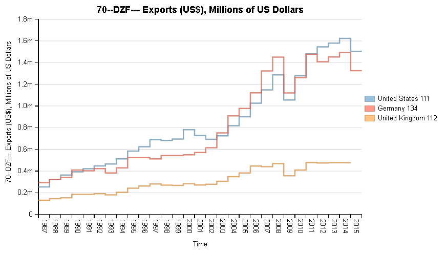
- Citation: International Monetary Fund (2017): International Financial Statistics (Edition: June 2017). UK Data Service.
DOI: https://doi.org/10.5257/imf/ifs/2017-06
More useful links
- Gapminder (a fact tank, not a think tank) promotes a fact-based worldview everyone can understand and provides data visualization tools to let people explore the vast treasure of global statistics.
- How to make infographics: a beginner’s guide to data visualisation.